
NAGARHOLE | SIGNAGE
A signage system built to disappear into Nagarhole National Park — except where disappearing would be dangerous.
Brand identity · Self-directed · 2025
Rebuilding a legacy name as performance eyewear.
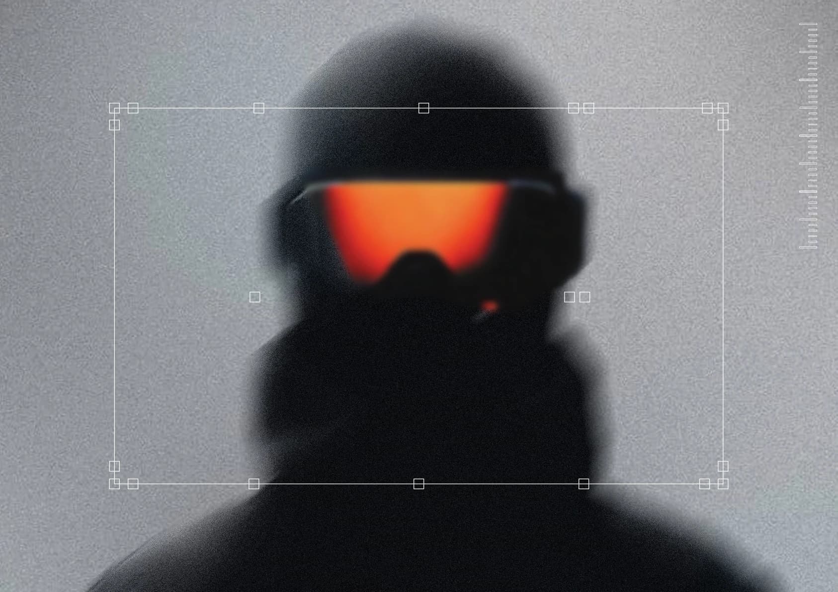
The context
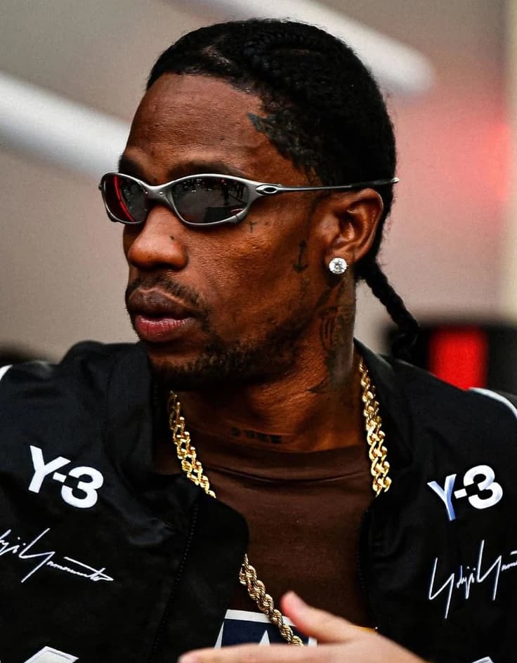
I got here because of a Travis Scott show, weirdly enough.
I spent way too long beforehand trying to find a pair of glasses I actually wanted to wear, and never landed on anything. That search stayed with me longer than the concert did. Titan already makes the kind of glasses you’d wear every day, and somewhere in all that looking I kept wondering what the brand would look like if it went after something rougher than that.
The brief was open, so I gave that problem to Titan. It’s a name that already carries weight, and performance is a segment it has simply never touched. The project is what that move would look like if the brand actually made it: three months, start to finish, on my own.
Sport is where my head goes by default, so that’s the version of Titan I built.

The problem
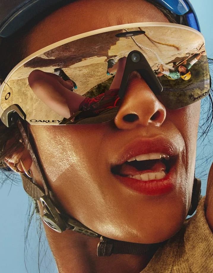
It reads as sport because it looks like sport, not because anything about it performs.
I wanted a brand that stayed calm and still held up in conditions that don’t care how it looks.
Precision. Performance. Protection.
The starting point
It needed to mean something and stay minimal. Those two things kept pulling against each other. Anything meaningful got busy, and anything minimal was just a shape.
The real problem was that I had no reference. I was trying to design performance without having looked at what performance actually is.






The turn
Not research, just a video. But the dive was clean, the correction mid-air was instant, and nothing about it was wasted. That was peak performance, and no one had designed it.
That pulled me into a longer read about how much of what we design has already been solved by something in nature first. Nature doesn’t separate form from function, because it was never given the option.
That became the thesis.
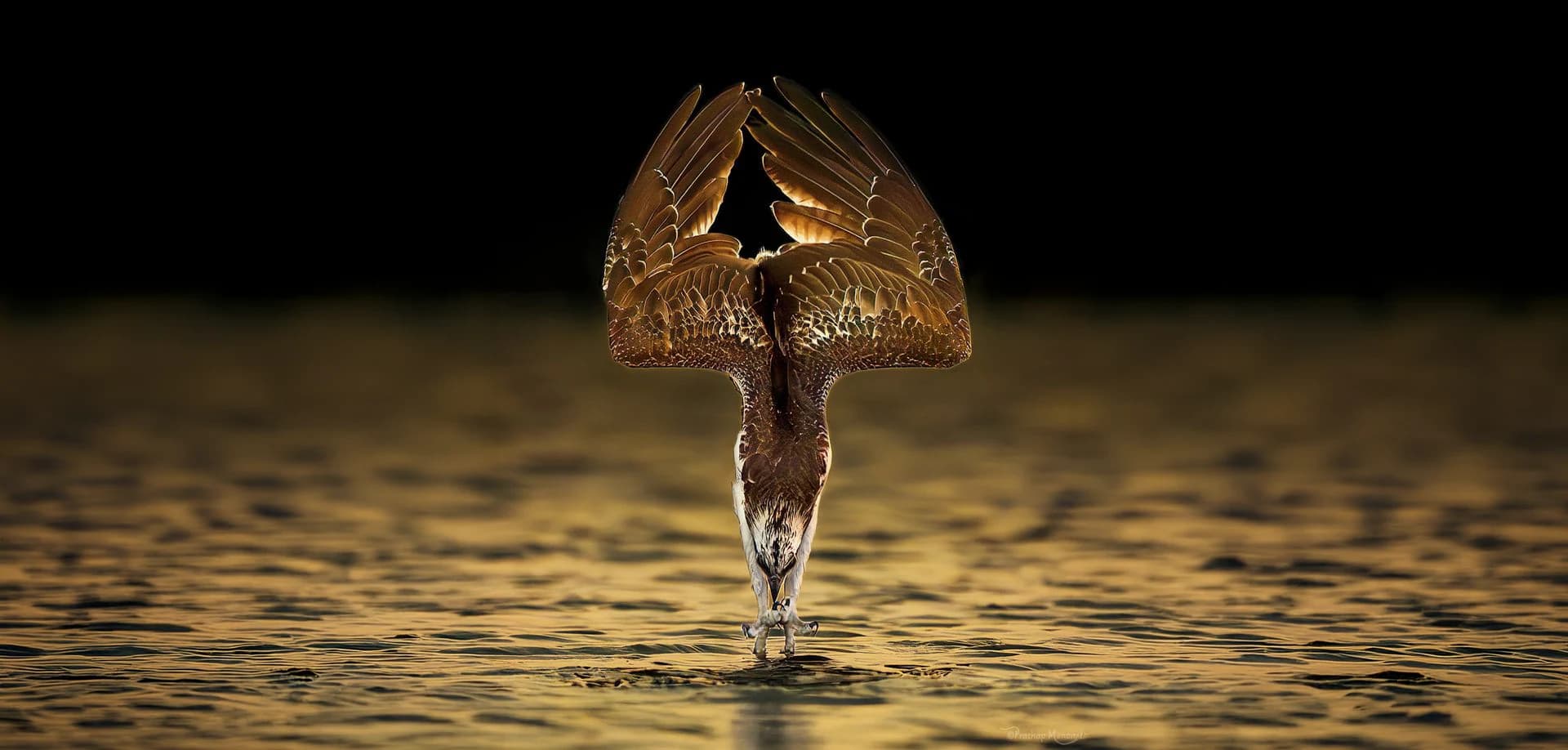
Nature is the perfect design.
The obvious eagle is a silhouette in flight. That would have made the mark about soaring, which isn’t what an eyewear brand should be claiming.
So I worked from the front of the head.
The animal has the sharpest vision alive, and the mark comes from the part of it that does the seeing.
Reference
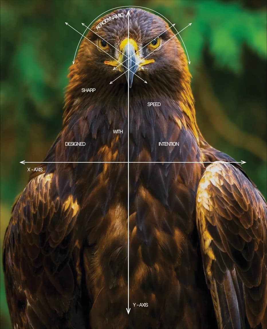
Construction
The correspondence, part for part: the brow ridge and outer eyes become the two upward curves, the terminals land where the eyes sit, and the beak drops through the centre as the stem. Read together they resolve into a T — the mark is the part of the animal that does the seeing, not the part that soars.
The typeface
Nothing off the shelf worked under the mark. Sharp corners read cold and brittle against its curves. Rounded corners went soft and lost the engineering. I kept trying new faces expecting the next one to solve it.
None of them did, so I stopped looking and cut one instead.
I took Morgant and redrew it, matching the corner radius to the mark. Once the radius was shared, the wordmark stopped fighting the logo.




Morgant, top. The cut, bottom. The circles mark the two joins that moved.
The system
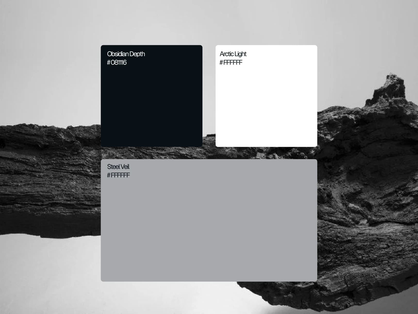
They were photographed on stone and charred wood rather than laid out as flat swatches.
Two gradients carry the two temperatures the brand works across. Blue to white for clarity. Black to orange for heat.
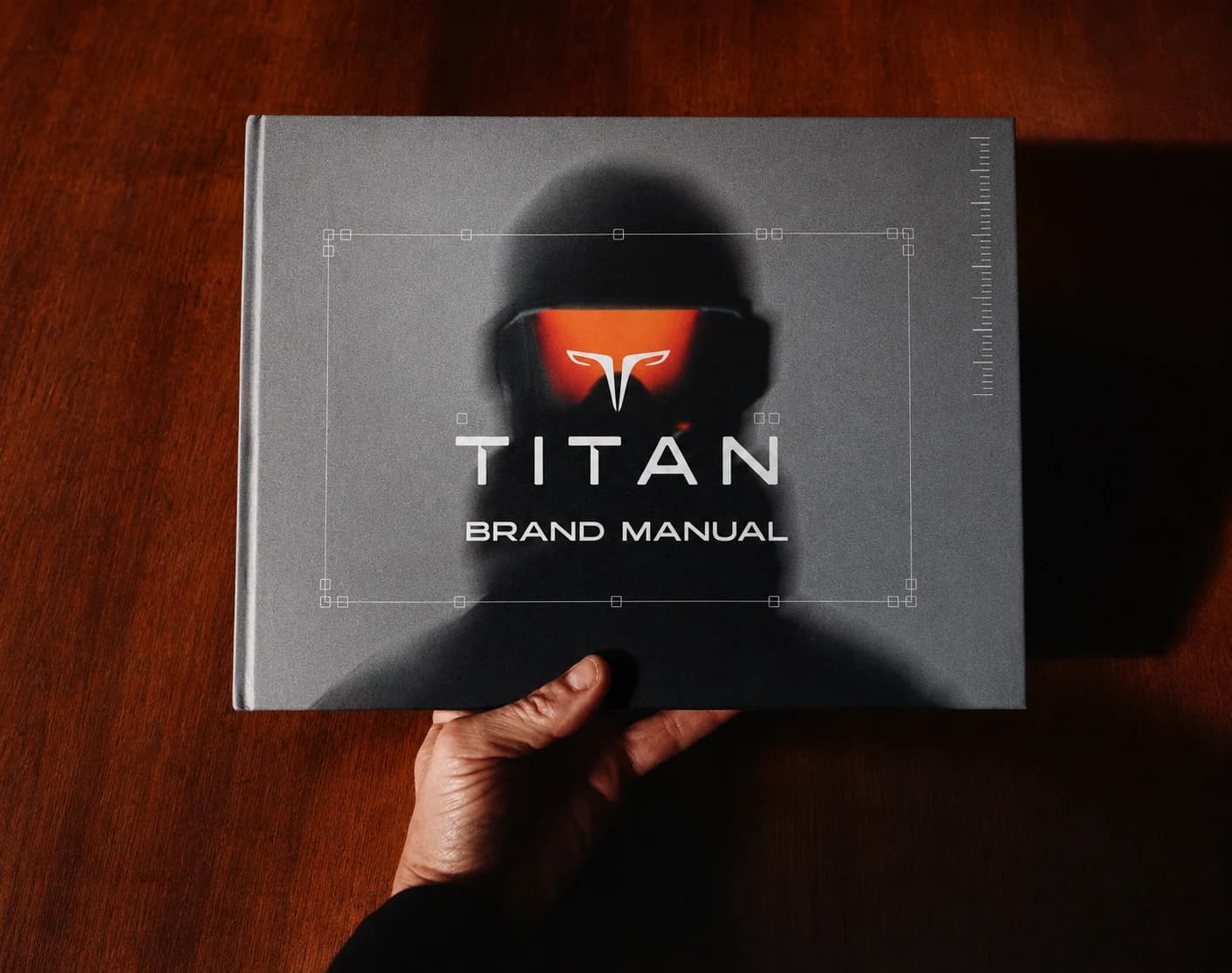
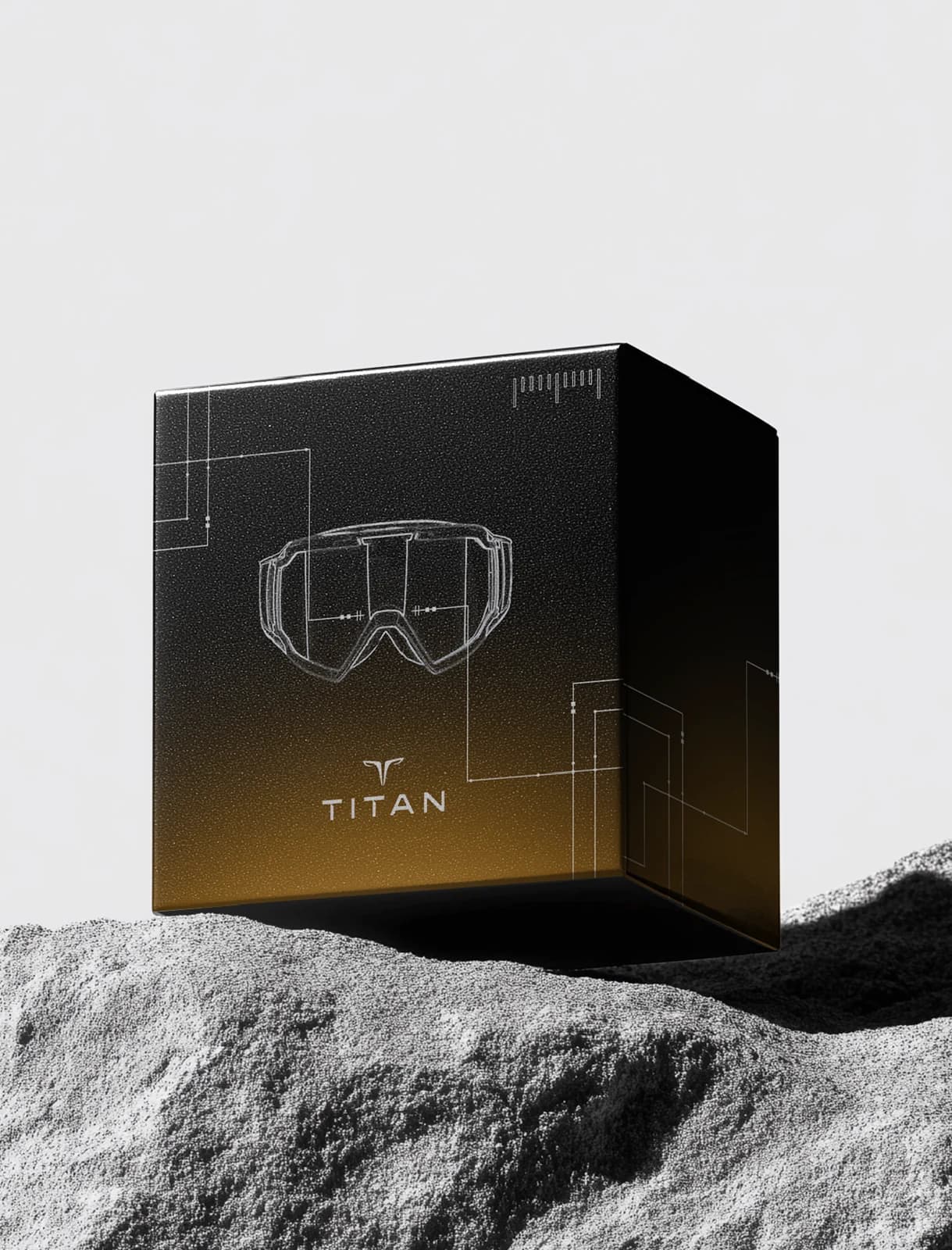
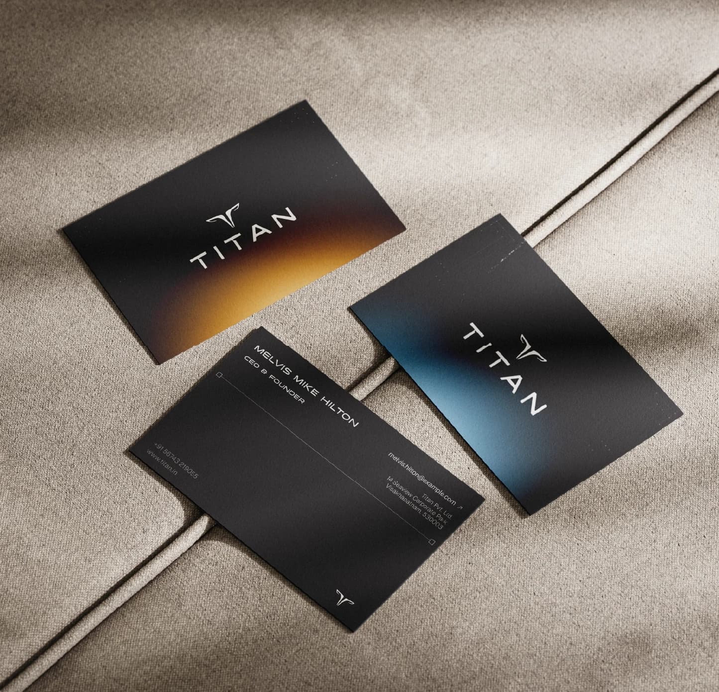
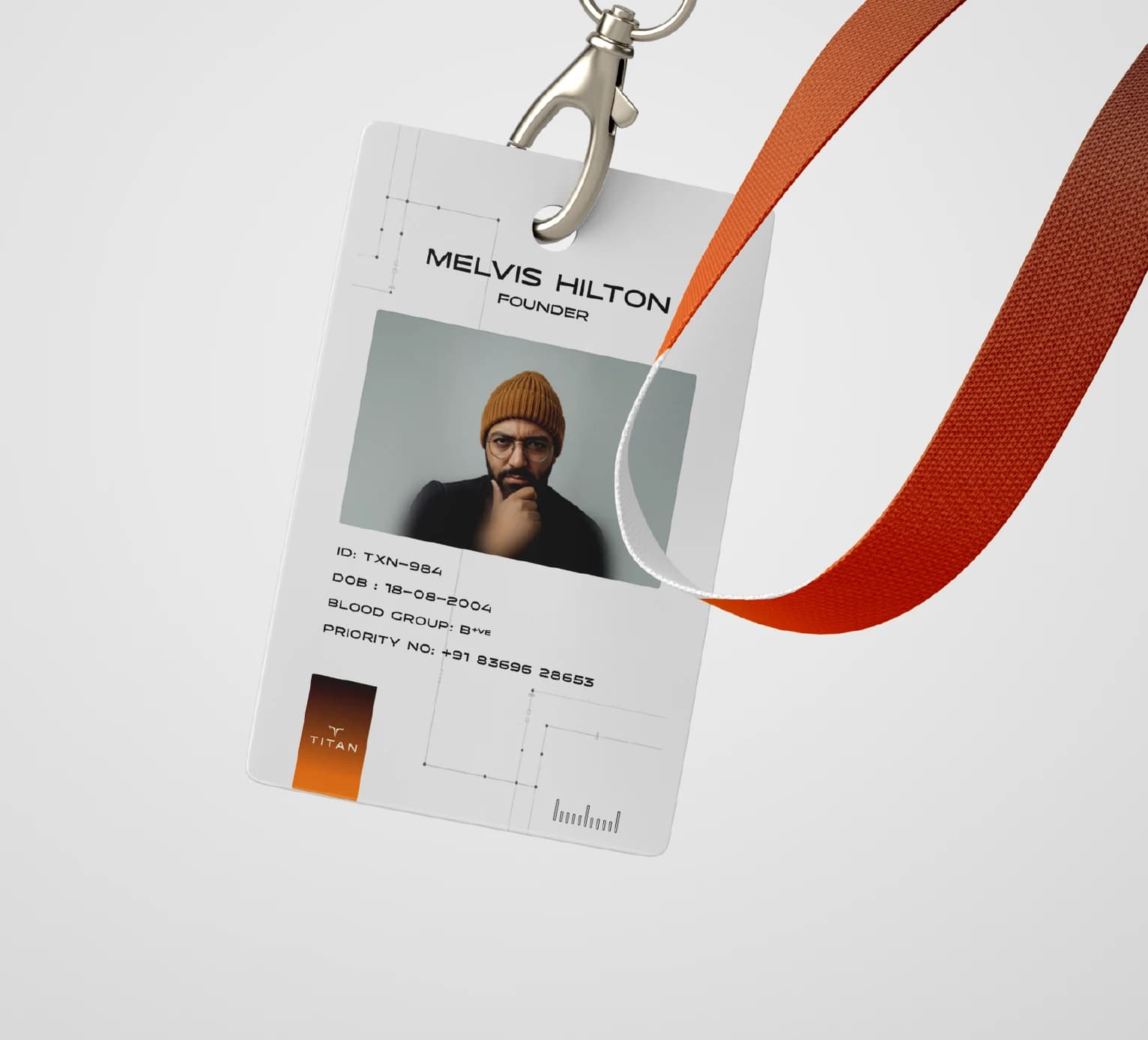
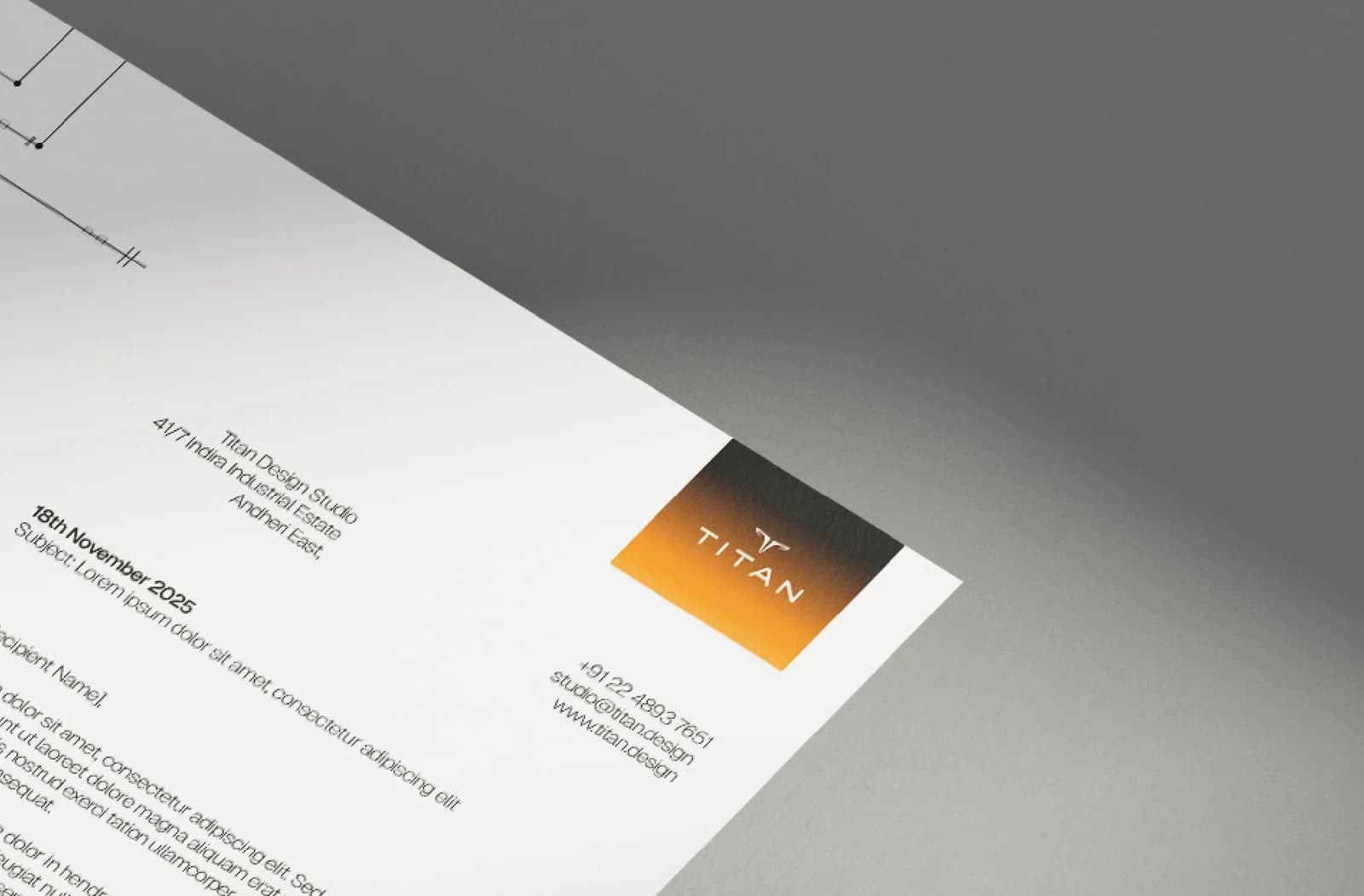
From there I built the system out across letterheads, cards, packaging and the site, because anything left theoretical would also have been left untested. The manual got printed rather than exported, which meant a few trips to the one shop I found with the paper and finish I wanted, two hours away.


In use
This is the part I wanted to see finished rather than described.
The campaign
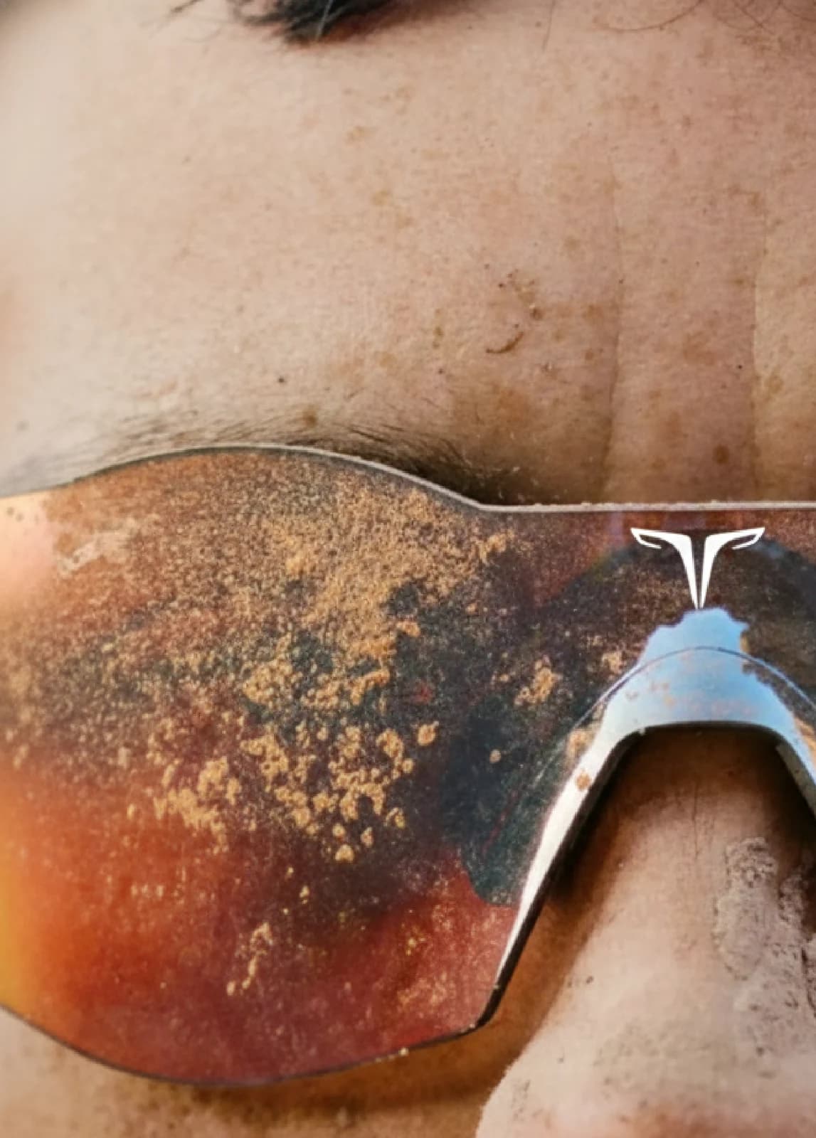
Each frame is shot on a person rather than a product, with the mark closing the bottom of the image after the scene has already done the work.
NOTHING GETS THROUGH.
It’s also what an apex predator’s design already guarantees.
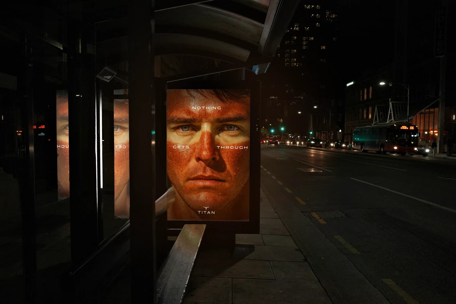
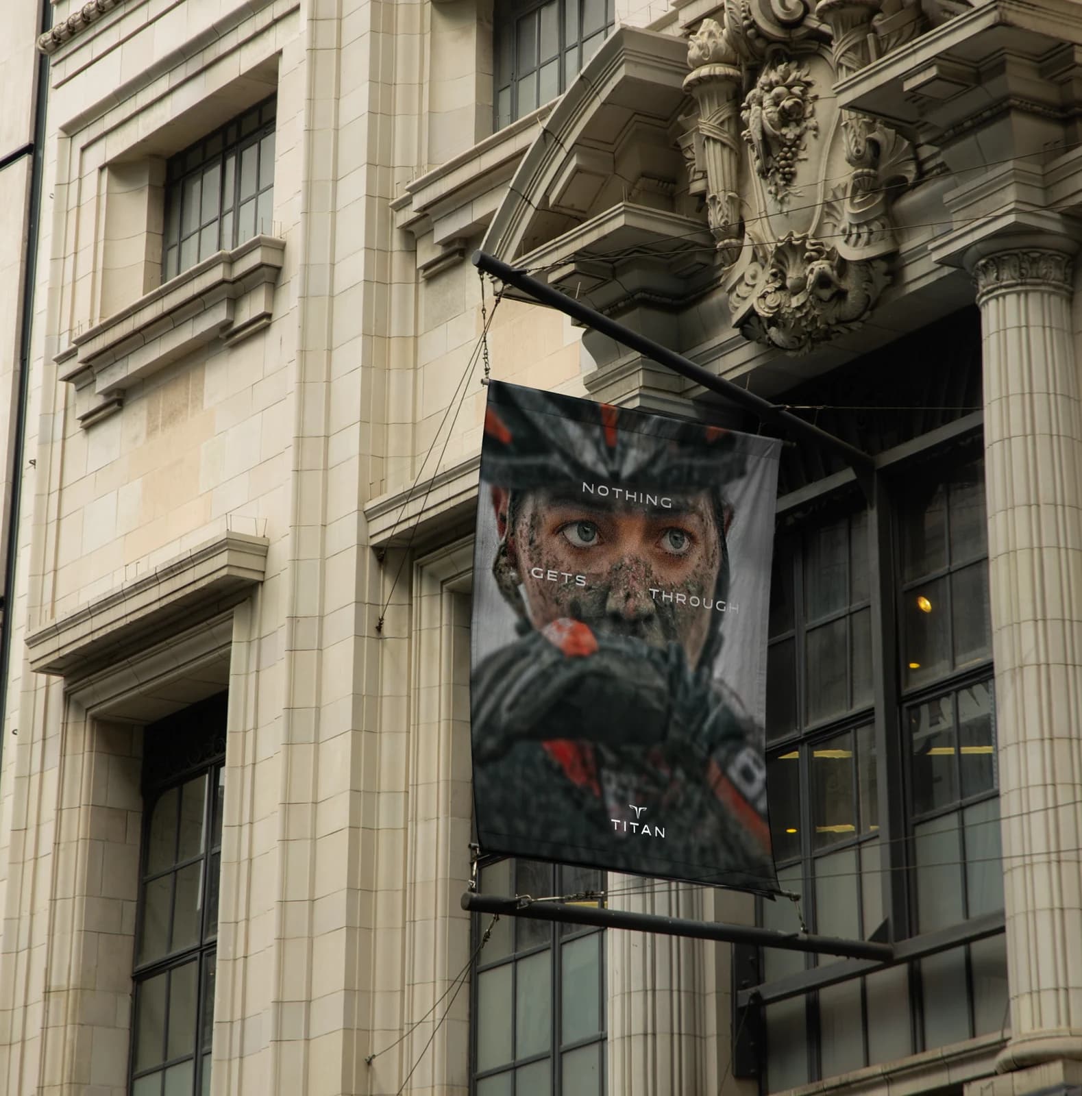
What stayed with me
I spent weeks collecting shapes I liked and got nowhere. One idea about how nature solves problems unlocked the mark, the palette, the tagline and the campaign in about a week.
If I revisited it, I’d put that idea at the front of the manual instead of leaving it implicit on the logo page. Someone reading the book cold would see an eagle-derived mark and assume I picked an eagle because eagles look sharp.
What I’m glad about is that the system held. Every part of it can be traced back to one thought, which is what made the last two months of building it out straightforward.
Scope of work
Not done yet?
A signage system built to disappear into Nagarhole National Park — except where disappearing would be dangerous.
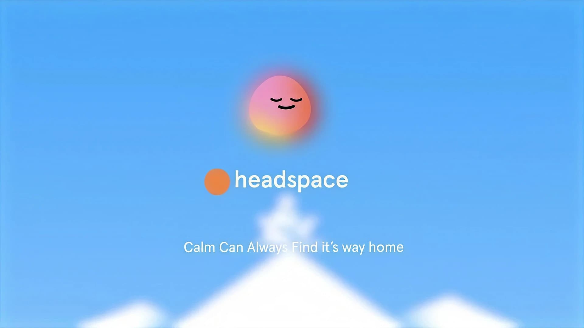
A 55-second spec brand film for Headspace, introducing ebb — a calm-focused AI companion.