EBB | MOTION
A 55-second spec brand film for Headspace, introducing ebb — a calm-focused AI companion.
Self-initiated coursework · Concept
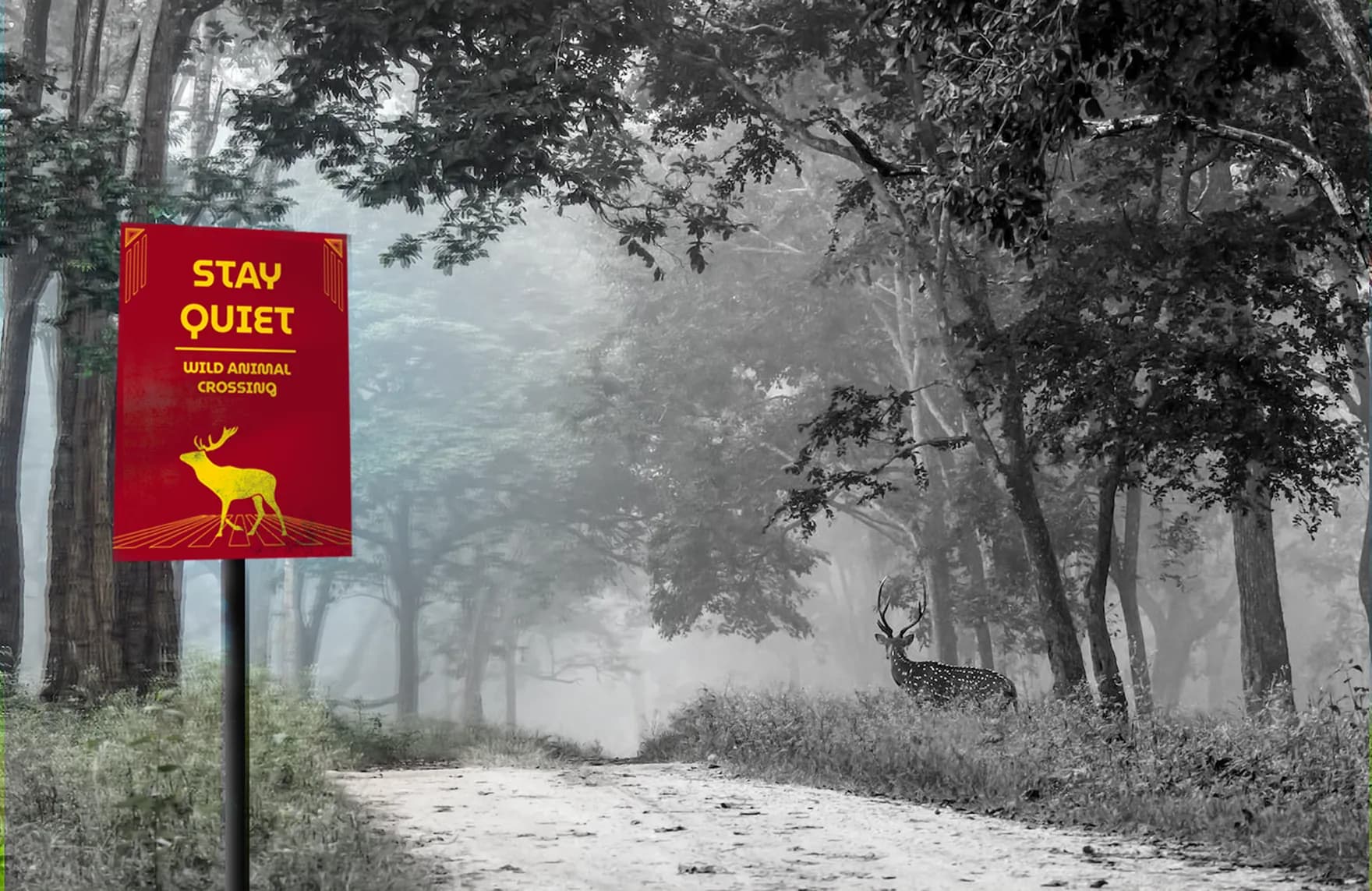
Every sign was built to disappear into the forest. The warning family breaks that rule on purpose, because camouflaged danger is a design failure.
Overview
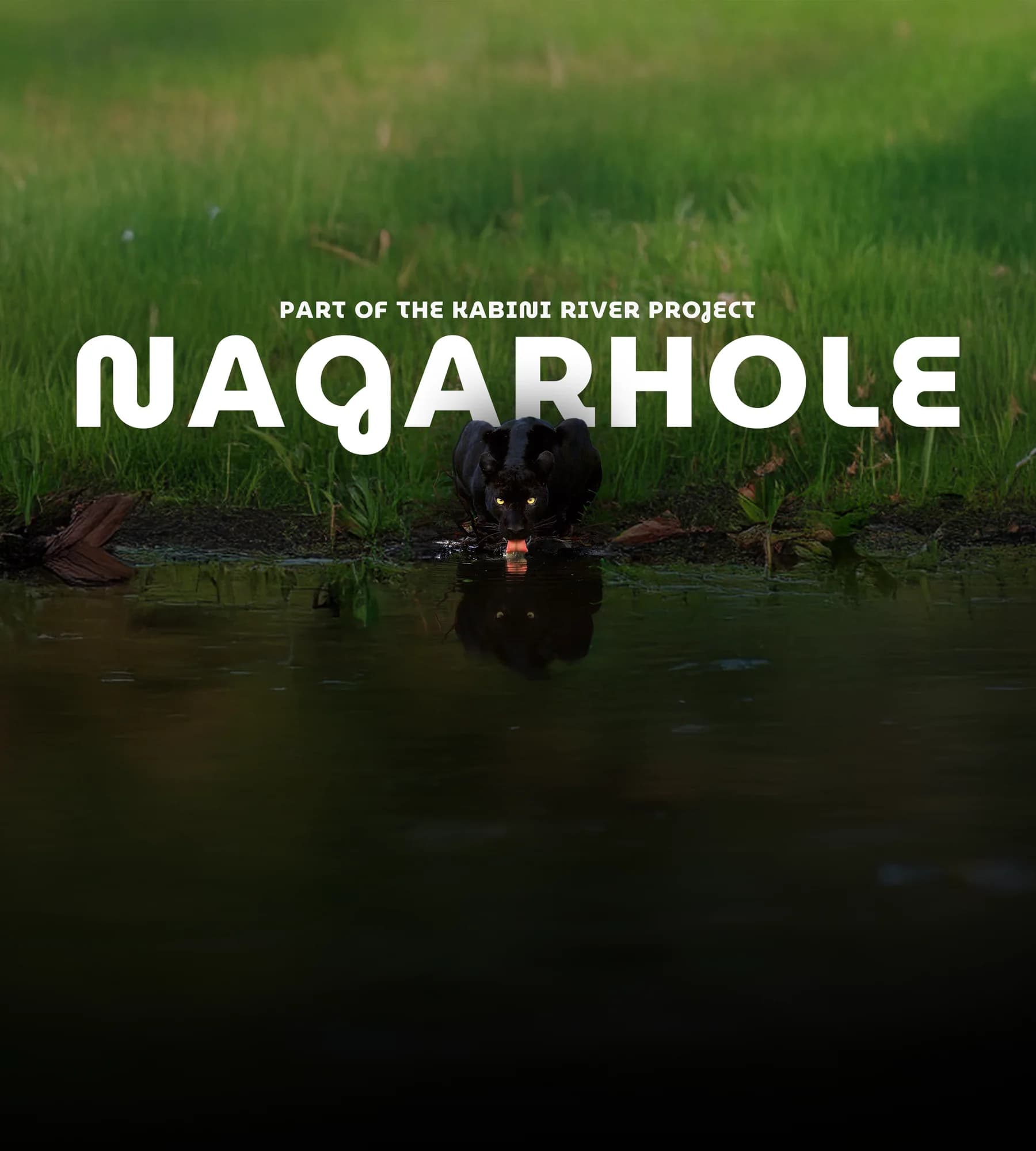
Nagarhole holds elephants, tigers, leopards and a large bird population across forest, grassland and the riverbanks feeding the Kabini. The signage there is visually inconsistent, hard to pick out against dense vegetation, and disconnected from the surroundings it sits in. It carries information but nothing about the experience of being there, so visitors are left to work out navigation, zone boundaries and safety instruction on their own.
The problem statement comes from secondary research and two interviews with people who had visited the park.
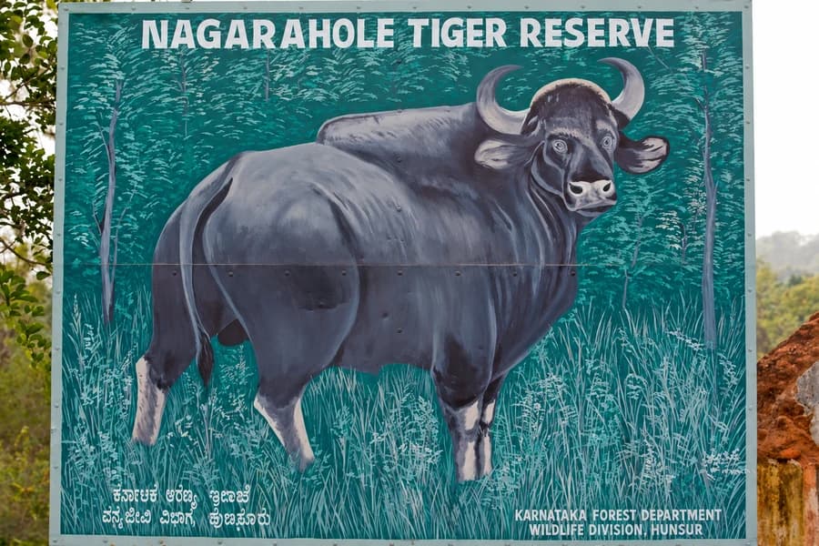
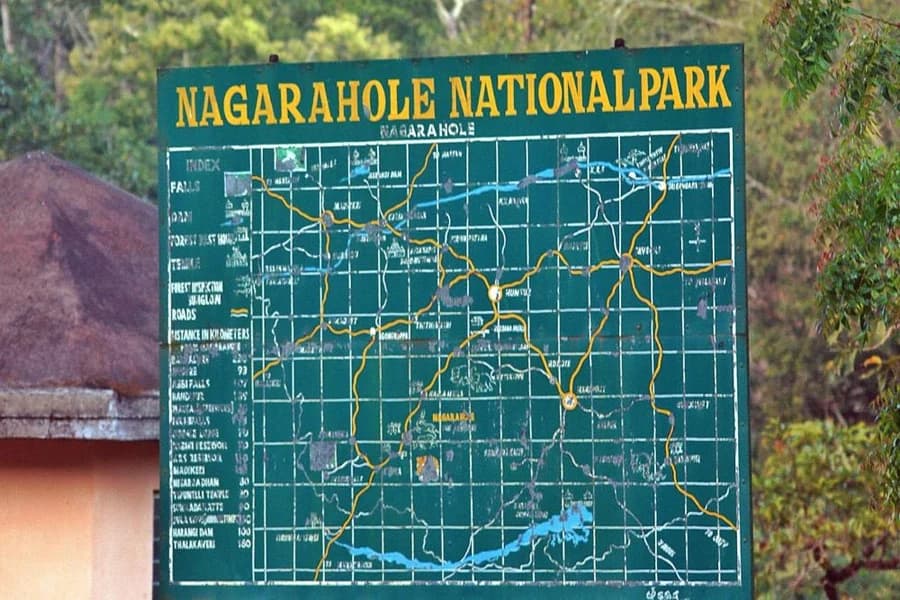
Two of the boards marking the park today — a hand-painted gaur board and a route map with no wayfinding logic of its own. Neither carries a safety instruction or connects to the other.
The system
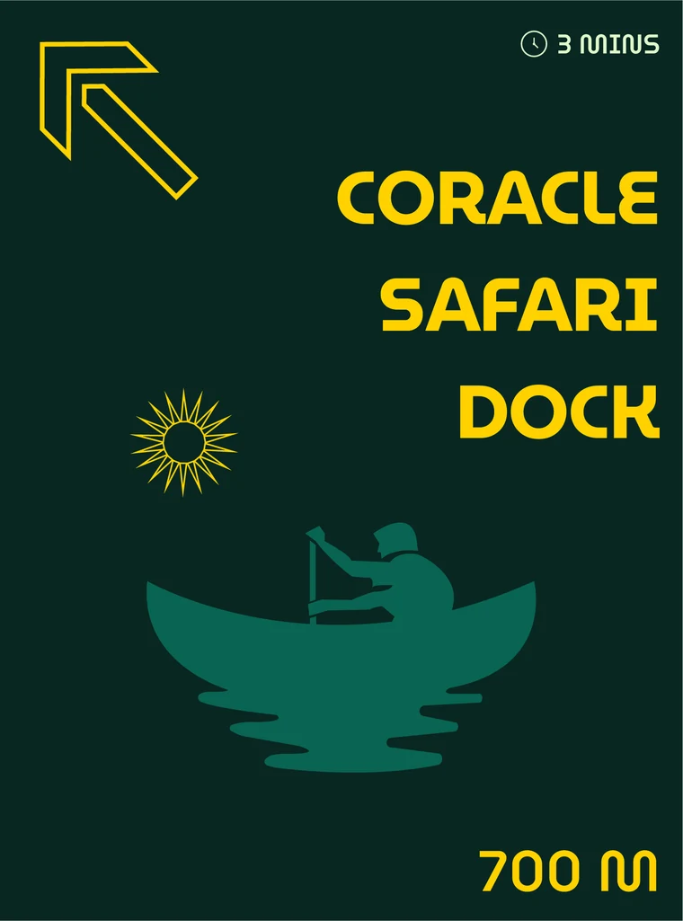
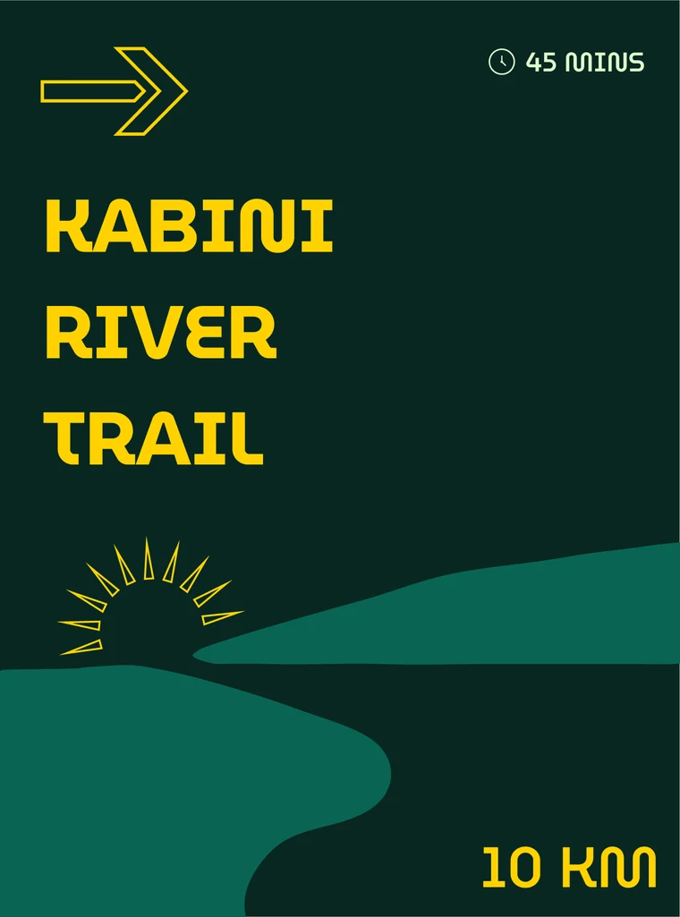
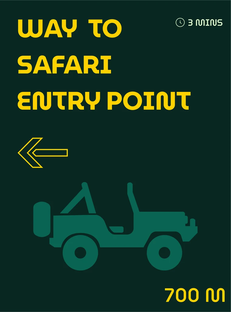
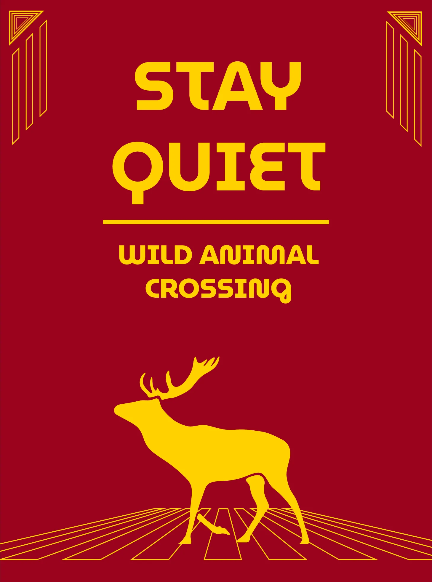
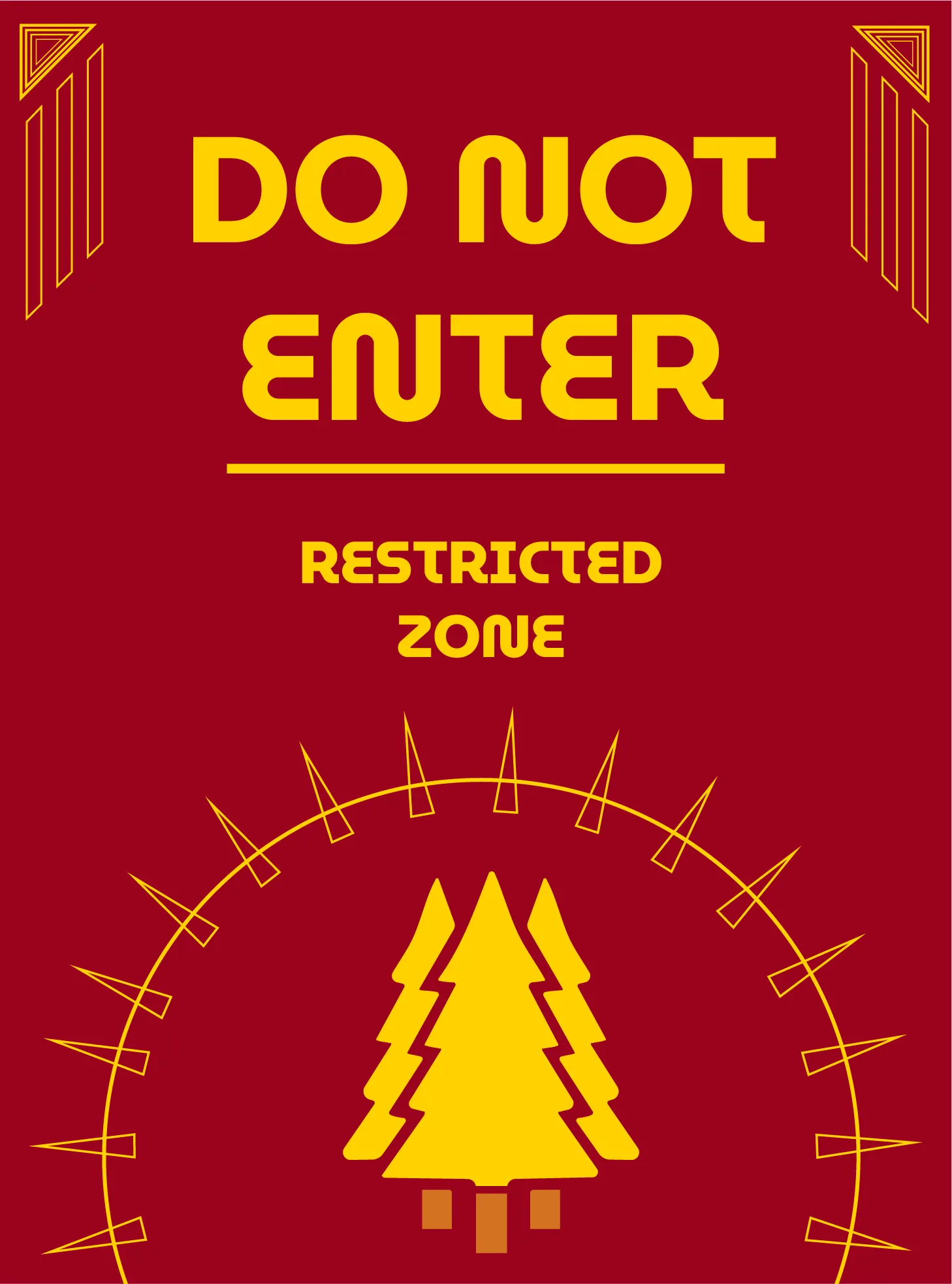
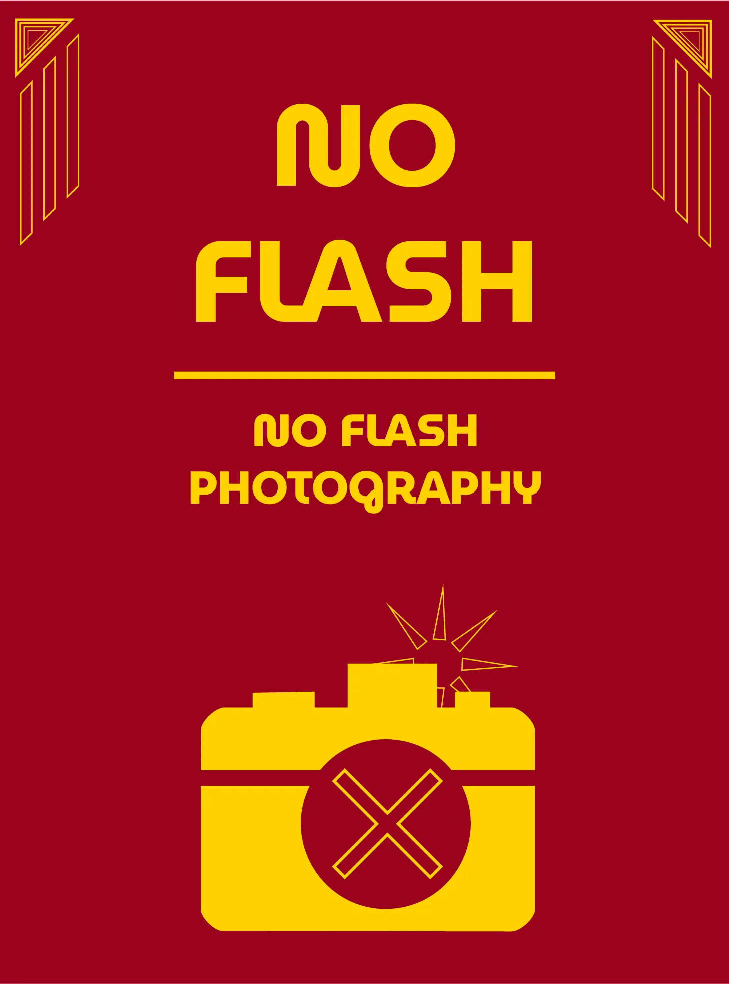
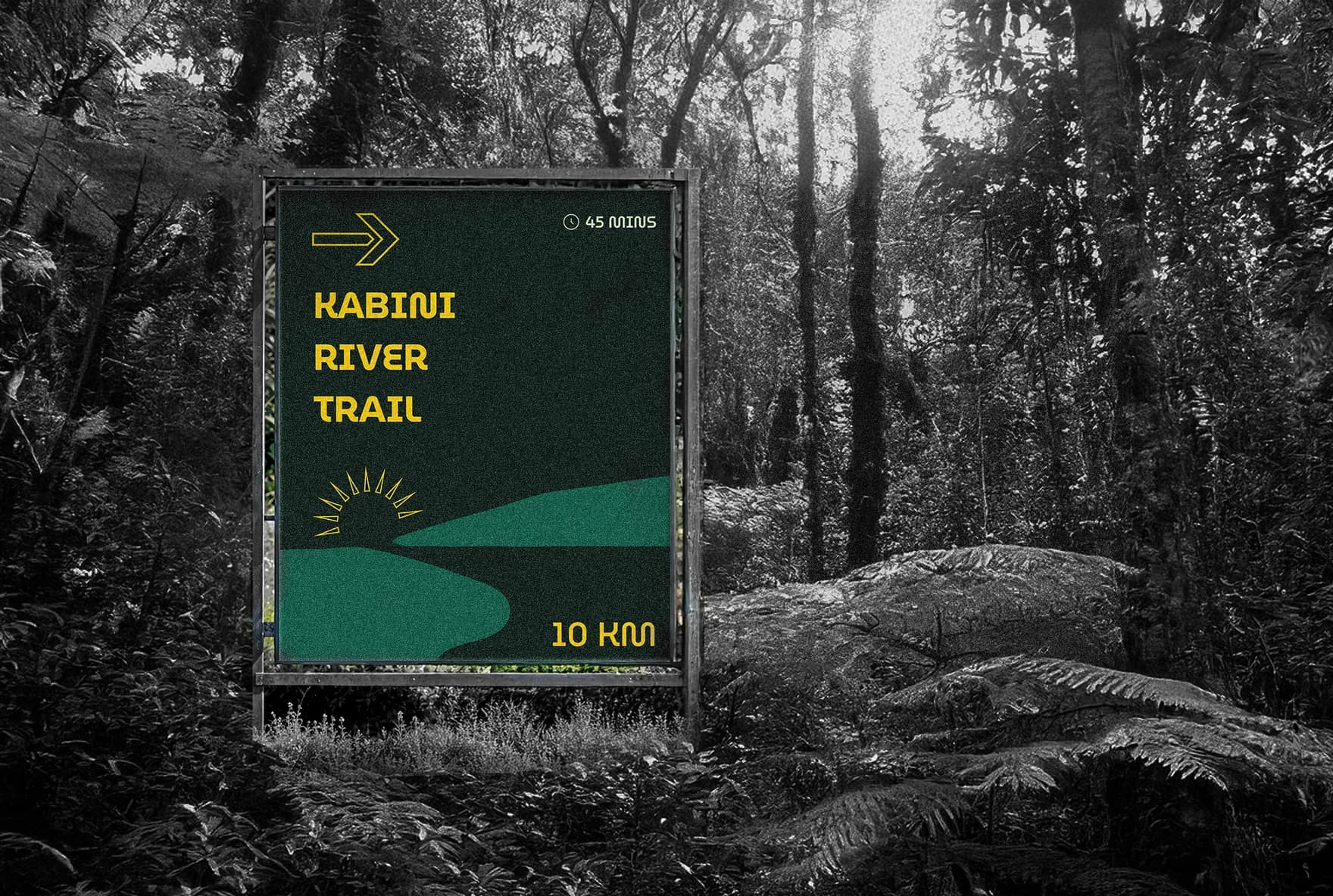
Yellow runs across all three families, and the base colour underneath it changes with the function: black and grey for information, crimson and orange for warnings, forest green for direction.
Each family opens at equal thirds and settles into the weighting it carries: yellow and the accent at a quarter each, the base at a half. Yellow is the constant and moves identically across all three.
The logo is centered around the letter “K,” representing Kabini.
Seamlessly integrated into the form of a leopard to reflect the park’s wildlife identity.

Three separate palettes look obvious side by side, but the brief asked for visual consistency across the park, and splitting the palette three ways is not an obvious way to deliver that.
Beyond the brief
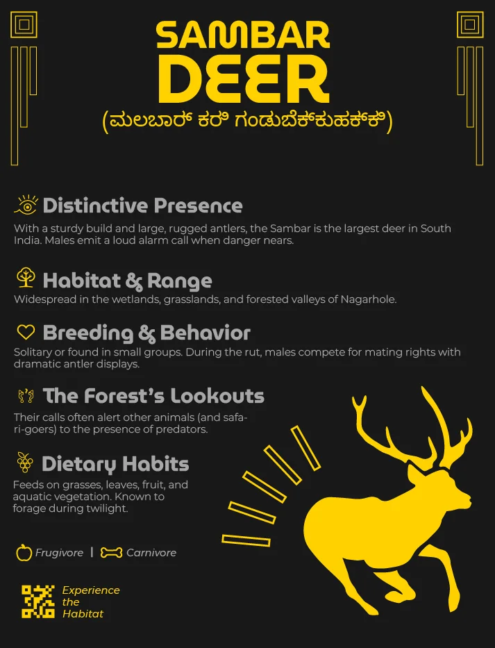
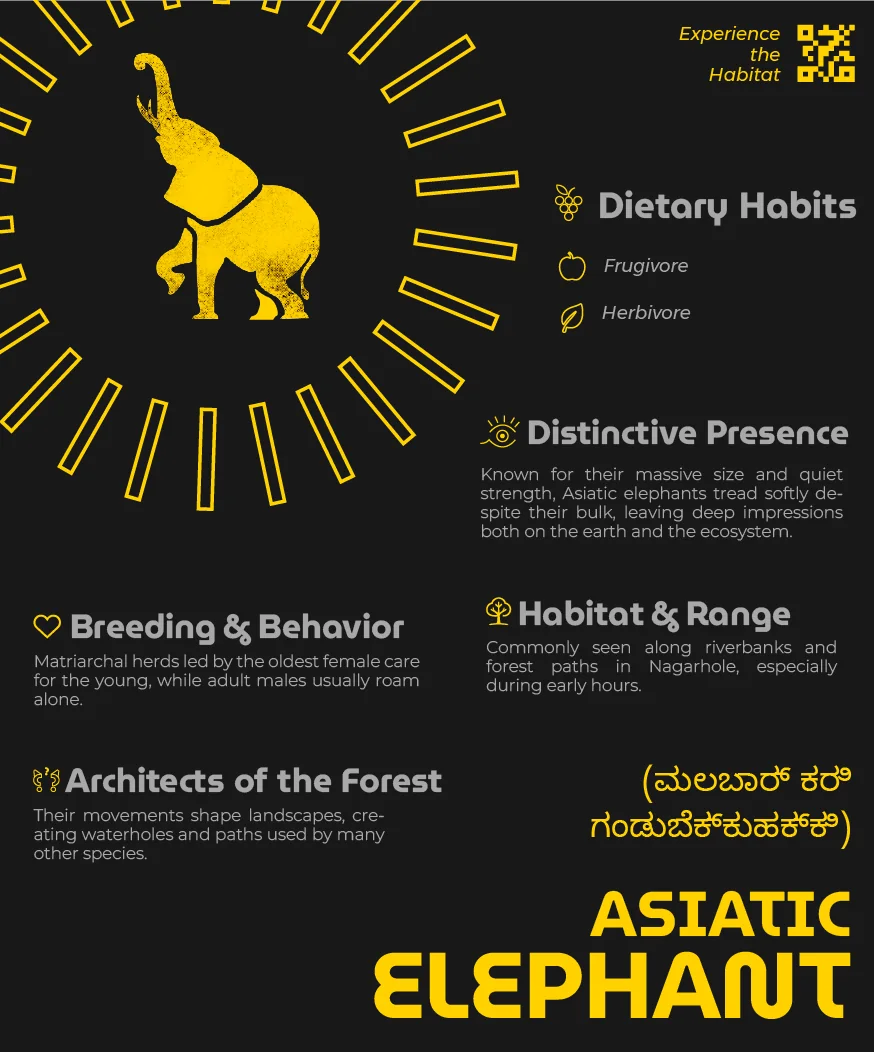
The course brief did not ask for a second language. I added Kannada names to the species boards anyway, on the grounds that a system claiming to reflect the cultural identity of Kabini cannot do it in English only.
It changed who the board is addressed to. Kabini sits in a Kannada-speaking district, and a board that names a gaur only in English is written for the visitor least likely to have grown up alongside one. The Kannada is set on the board itself, directly beneath the English and at the same weight, so it reads as part of the sign rather than a translation added to the end of it.
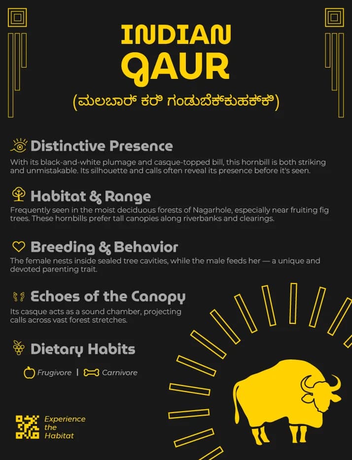
Self-verified, and applied to only one of the three families. It cost verification I was not qualified to do, and it left the safety-critical signs monolingual.
The type
Every board is set in MuseoModerno. Its skeleton is geometric — near-circular bowls, wide apertures, strokes of almost even weight — which is what holds a name together at the distance a sign is actually read from, under canopy where the light is low and flat.
The rounded terminals are the reason it is this face and not a grotesque. A park is not a municipal building, and a sign that reads as official is a sign a visitor skims past. Montserrat sits underneath it for the long copy — the paragraphs on a species board run to five sections, and a display face asked to carry that much text at small sizes stops being a display face.
Set on the information family's own base and yellow, because a specimen on white would be showing the face somewhere it never appears.
Both are open-licence variable families, so the whole system is two files and neither weight nor language coverage costs another download.
The mark
Nagarhole’s main draw is the black leopard, so the mark had to carry it. The K of Kabini already resembles a leopard in profile, and letting the letter resolve into the body means the logo works as a single form instead of a wordmark with a mascot sitting next to it.
That division of labour is what lets the rest of the system stay plain. The mark carries the park’s reputation, so the boards underneath it are free to do their own job — a gaur board can be about the gaur, and a warning board about the warning, without either of them arguing for Nagarhole as a place to visit.


The small marks travel with the animal rather than sitting in a legend — a heart for breeding, fruit for diet, motion lines for call and movement — so the same vocabulary can head a board, key a section inside it, and shrink to a map pin without being redrawn.
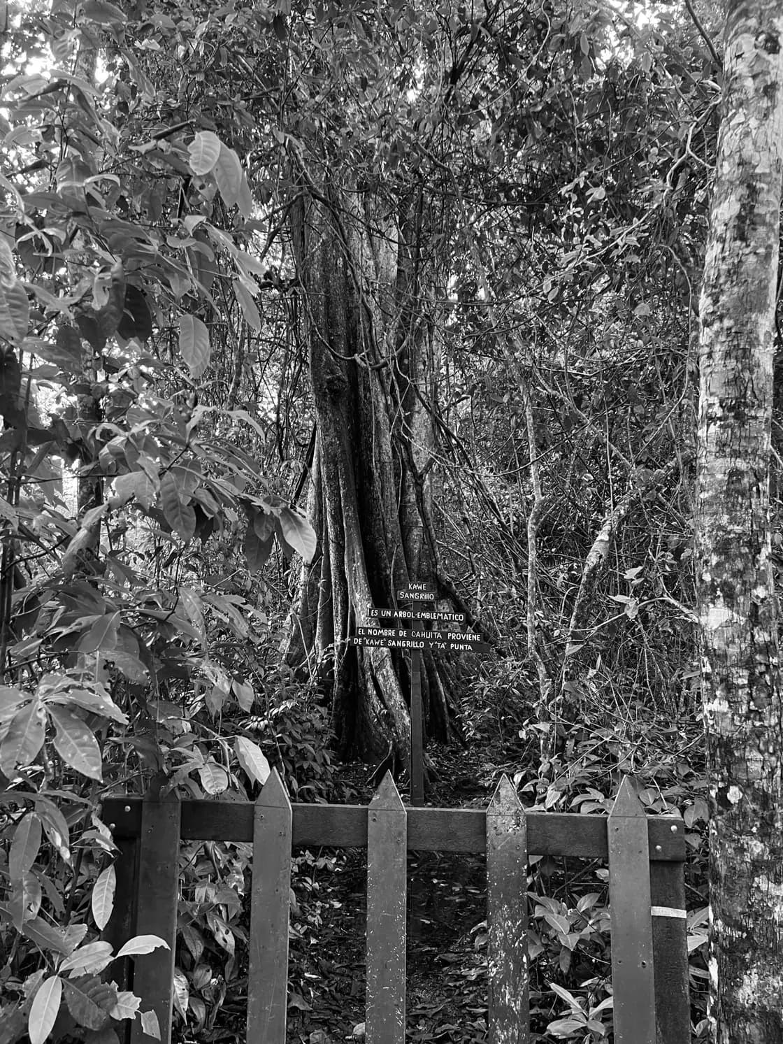
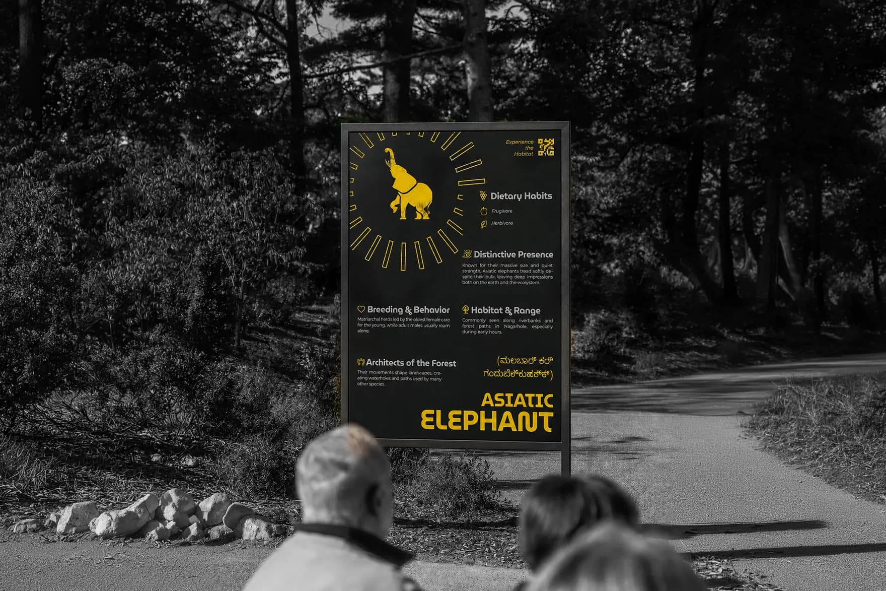
In the forest
Where it stands
Nothing is installed. The system was never shown to the forest department, a tourism operator or anyone who works in Nagarhole. The species copy on the boards is assembled from secondary sources and checked for plausibility rather than verified for accuracy.
Reflection
Kannada was not in the brief. I put it on the species boards because a system claiming to carry the identity of Kabini should not speak only English, and I was pleased with that decision for two months. I never carried it to the warning signs. So in a Kannada-speaking district I made the board about breeding habits readable and left the sign that says do not enter an elephant corridor in English, and I did not notice until someone asked me which family had been translated.
Scope of work
Not done yet?
A 55-second spec brand film for Headspace, introducing ebb — a calm-focused AI companion.

A visual strategy builder for Indian options traders — a canvas beside the form it replaced.